New Goodnites design for Girls 2016

Status
Not open for further replies.
gnites said:
Photos attached, Camo print is out of a pack i bought 2 weeks ago (5 layer non new prints)

These measurements are a little silly at the end of the day the true test is how they fit when you put one on. I can say from my personal experience that I can feel the size increase when I put one on which to me is what matters. If Goodnites did not fit you before they still will not and if they fit before you'll have a little extra room.

As i've said from the first post its not a huge difference but a small step in the correct direction over the trend of going smaller with each new version.

View attachment 26741View attachment 26742View attachment 26743View attachment 26744

Nice, I like camo. I think green camo would be more suitable.
 
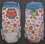
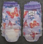
I found the owl prints and butterfly prints at a Walmart today (southern USA)! It was still the old packaging, but looking at the white edge (11-pack) I could see through and the new pattern. I love the owl design even more than I thought I would.

I'm not seeing any difference in length as compared to the previous design; both are 24 inches long stretched out maximally. To get this measurement you have to really stretch it to its limit (you can feel when it won't give any more stretch). I don't think these are taller like the 2012 and before ones before they shortened them.

Mass-wise, these seem to be a few grams lighter (51g vs 56g), though each varies by a few grams. Quality is good at least in the pack I got. The long wait is over. Now to find some with the new packaging...
 

Attachments

  • 2016 Owl.jpg
    2016 Owl.jpg
    92.1 KB · Views: 2,000
  • 2016 Butterflies.jpg
    2016 Butterflies.jpg
    84.9 KB · Views: 6,585
The new design is amazing! Thank you for sharing the pictures!
I love both the owl and butterflies designs and would love to wear them. I can't believe though they are intended for teenagers, especially the owl one. I didn't expect the colors to be so vivid on the owl design.
That's funny how the printing fades at the crotch, probably for some cost savings purpose.
 
Mickael75 said:
I didn't expect the colors to be so vivid on the owl design.
That's funny how the printing fades at the crotch, probably for some cost savings purpose.

They might appear a little more vivid than they are, but they definitely have a lot of solid colors on the owl one. It really does seem like it's for a younger age group, unlike the butterflies one. The owl uses simple graphics and is more character based, with the owl, flowers, leaves, and a tree on the back. I really like this design since it has so much symbolic meaning. While the butterflies one has complex details and patterns, and is more abstract. I guess it makes sense that they can make them a little more appealing over a wider age range with this approach.

People have said that the fading in the middle is to help the printing machine find the invisible ultraviolet-inked marker. I still think that it's also so parents can more easily do a wet check. Though, those machines that produce these run at a blinding speed so it might need this much clear space around that alignment marker.
 
Thank you for all these detailed information.
You are right about the wider age range, with the owl ones probably designed for younger girls. The L/XL size is targeted for children from 8 which is indeed young. The other ones are still fine for girls aged up to 14.

That's an interesting hypothesis for the fading in the middle. I don't think it's intended for parents a Goodnites are targeted for the night time and there should not be the need to check during the night. Children aged 8-14 can throw away their Goodnite in the morning by themselves if it is wet.
 
I hope the ones I subscribed to on Amazon are the new ones.

Sent from my LGL31L using Tapatalk
 
Mickael75 said:
That's an interesting hypothesis for the fading in the middle. I don't think it's intended for parents a Goodnites are targeted for the night time and there should not be the need to check during the night.

I got the impression that Goodnites are also used for developmentally-delayed/stunted children that have full-time care. They're essentially diapers for older children, even though they're marketed as being for just for bedwetting. The marketing is to encourage a larger market for that use. For full-time caregivers, it's not a question of whether diapers will be used, so there's no need to market to them (and they know enough that they aren't only useful for bedwetting).

This thought also came about because the 2010 designs with that background diagonal stripe all over the pant made it difficult to visually tell whether they were wet. Later designs went back to having mostly/all white near the middle (except maybe the zebra-print one).

I wonder how other versions of Goodnites handle this. I seem to remember that Underjams had some solid colors across them. Maybe they align their machines differently than for Goodnites. It just seemed odd that they'd let something like this impact their graphic designs so noticeably, given how capable technology is.
 
Prairie said:
I found the owl prints and butterfly prints at a Walmart today (southern USA)! It was still the old packaging, but looking at the white edge (11-pack) I could see through and the new pattern. I love the owl design even more than I thought I would.

I'm not seeing any difference in length as compared to the previous design; both are 24 inches long stretched out maximally. To get this measurement you have to really stretch it to its limit (you can feel when it won't give any more stretch). I don't think these are taller like the 2012 and before ones before they shortened them.

Mass-wise, these seem to be a few grams lighter (51g vs 56g), though each varies by a few grams. Quality is good at least in the pack I got. The long wait is over. Now to find some with the new packaging...

How well do they swell? Can we see how well they bulk up?
 
Last edited:
As the boys aren't really that appealing to me I might just buy the girls when I can. I partially like the owl print I wish the boys would do the same and do a print for each side of the age range.
 
Prairie said:
I got the impression that Goodnites are also used for developmentally-delayed/stunted children that have full-time care. They're essentially diapers for older children, even though they're marketed as being for just for bedwetting. The marketing is to encourage a larger market for that use. For full-time caregivers, it's not a question of whether diapers will be used, so there's no need to market to them (and they know enough that they aren't only useful for bedwetting).

This thought also came about because the 2010 designs with that background diagonal stripe all over the pant made it difficult to visually tell whether they were wet. Later designs went back to having mostly/all white near the middle (except maybe the zebra-print one).

I wonder how other versions of Goodnites handle this. I seem to remember that Underjams had some solid colors across them. Maybe they align their machines differently than for Goodnites. It just seemed odd that they'd let something like this impact their graphic designs so noticeably, given how capable technology is.

This discussion could make a topic of its own!
I am not sure that Goodnites are used "professionally" (I mean medically). Children seem to wear tape diapers in that case.
Plus, I am not sure the non-printed part at the crotch makes it really easier to check for wetness, as Goodnites keep quite well the pee inside and just get a bit more yellowish but not that much when wetted. Having a look to how bulky they are would even give a better insight, don't you think?

I agree however with you that they seem not to be intended only for the night, as they are very solid throughout the day with a lot of movements. I suspect the back that is not very absorbent but still has some thin padding to be there for bigger accidents.

Anyway, I like your hypothesis but I still think that the faded printing is for ink saving!
 
Prairie said:
I found the owl prints and butterfly prints at a Walmart today (southern USA)! It was still the old packaging, but looking at the white edge (11-pack) I could see through and the new pattern. I love the owl design even more than I thought I would.

I'm not seeing any difference in length as compared to the previous design; both are 24 inches long stretched out maximally. To get this measurement you have to really stretch it to its limit (you can feel when it won't give any more stretch). I don't think these are taller like the 2012 and before ones before they shortened them.

Mass-wise, these seem to be a few grams lighter (51g vs 56g), though each varies by a few grams. Quality is good at least in the pack I got. The long wait is over. Now to find some with the new packaging...

Wow, they're even cuter than I thought! Just a matter of time before they start appearing around here, the stores around me usually do a good job of staying up-to-date stock-wise. I want the owl ones soooo bad...
 
I weighed several of the new owl/butterfly L/XL 11-packs and they're definitely lighter than the old: 565g vs. 619g, which comes out to 51g vs. 55g per pant (plastic package is 7g). There are a few grams of variation between packages, but never anything near 54g, so I think this is a clear reduction in material for the owl/butterfly L/XL ones.

Oddly, the boys' L/XL 11-packs in the previous design are 680g per package. More absorbency? I don't think they could have absorbed 60g of moisture from the air while being stored. Hmmm.

Tip if you like one design more than the other: check the ends/top of the pack and get ones that have your design there. For the 11- and 25-packs, you can see through the white plastic on the ends (be sure both sides have your preferred pattern). For the 34-pack, you can see the ends of the clear plastic-wrapped stacks through the opening in the middle of the top and bottom of the box. The 11-, 25-, and 34-packs all have odd numbers of pants in each stack (the 34 pack has two internally-wrapped stacks of 17 pants). This means that there is one more of the end design than the other, since they alternate. Just a nice way to get a little more of your preferred design.
 
Last edited:
Prairie said:
I weighed several of the new owl/butterfly L/XL 11-packs and they're definitely lighter than the old: 565g vs. 619g, which comes out to 51g vs. 55g per pant (plastic package is 7g). There are a few grams of variation between packages, but never anything near 54g, so I think this is a clear reduction in material for the owl/butterfly L/XL ones.

Oddly, the boys' L/XL 11-packs in the previous design are 680g per package. More absorbency? I don't think they could have absorbed 60g of moisture from the air while being stored. Hmmm.

Tip if you like one design more than the other: check the ends/top of the pack and get ones that have your design there. For the 11- and 25-packs, you can see through the white plastic on the ends (be sure both sides have your preferred pattern). For the 34-pack, you can see the ends of the clear plastic-wrapped stacks through the opening in the middle of the top and bottom of the box. The 11-, 25-, and 34-packs all have odd numbers of pants in each stack (the 34 pack has two internally-wrapped stacks of 17 pants). This means that there is one more of the end design than the other, since they alternate. Just a nice way to get a little more of your preferred design.

Any change in absorption at all? Do they "bulk up" differently than the last generation?
 
Dos the new designs are on target?' And mostly buying online?'
 
Anyone here had success ordering these online? Specifically Amazon?

Unlike a lot of us, I personally don't have the guts to buy in person. Hahaha.
 
I haven't seen them at Target yet (nor my local large chain supermarket).

Also, word of warning: I saw some with the new package design showing the owl print, but looking through the sides it contained the old butterfly and hearts pants. So always look through the sides of the package for the proper designs inside.
 
(to above) should have red your comment first
I have some of the new girls, i was kinda pissed there are no owls, though the boys had the new design "these show it on the out side but have the old flower on the inside)but they are quite a bit different than the old one,s , I would say yes its lost a little bulk, but strangely way more crinkly than the last ones i had, and these fit great.
still a tiny bit low on the back but kudos goodnites, for more stretch and a bit more room. These new improvements make them feel like the (always Brand) underwear. Which have a bit of crinkle.( but a way better fit now ) as many have said.
 
Got some of the new designs today, here's the packing:

Found at a Target... Which was out of freaking almost every GoodNites :| (No TruFit Inserts (any size), no GoodNites S/M pullups, only one pack of Girl S/M TruFit underwear. Only had 4 packs of these, I was going to grab all 4, but decided not since there was a mom looking at them as well.

Click the link under the image for a larger view :)

GoodNites_2016_Front_Back.jpg
Larger View


GoodNites_2016_Front.jpg
Larger View

GoodNites_2016_Back.jpg
Larger View

GoodNites_2016_Sides.jpg
Larger View
 
Last edited:
I find I like looking at packages of my nappies and reading them for some reason.
 
Status
Not open for further replies.
Back
Top